Global Witness is definitely a “see something, say something” organization. It exposes how industries fuel and profit from climate destruction and stands with citizens to fight back and defend their communities and rights.

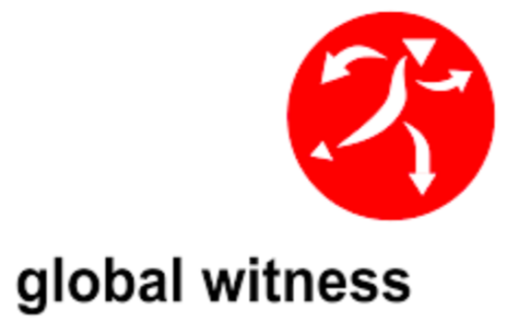
The group’s previous logo was a fluid and unimpactful human figure formed from red arrows. It portrayed action but not authority. Something More has created a new logo that truly embodies the strength and purpose of Global Witness. This smart design is a visual portmanteau of an eye and a megaphone. Further, the “rays” emanating from the symbol can stand for vision/radar or speaking out, an apt representation of the organization’s mission to “see and speak the truth.”
The use of black and red, plus two strong typefaces—Founders Grotesk and Tiempos—continue the sense of strength and authority.


