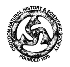
The Croydon Natural History & Scientific Society (CNHSS), founded in 1870, gets most of its funding through subscriptions. The organization contacted design firm 31% Wool to develop a new identity that would appeal to a wider demographic and bring in more donations.
The group wanted to keep the central symbol in its existing logo, a shape based on a Saxon bronze disc found in Victorian times in a local cemetery. So the designers cleaned up the symbol and paired it with the variable font Kalnia, a typeface that was inspired by the Victorian era. They also muted the red used in the old system and paired it with a similarly toned palette of complementary colors. New illustrations were also added to the identity in order to expand the brand’s visual appeal. From the 31% Wool website:

“[We] worked with CNHSS to select images to represent their seven areas of study—often choosing symbols that were unique to the local area. Each area of study was allocated a colour to give the organisation a more flexible colour palette than their existing red and black.”


